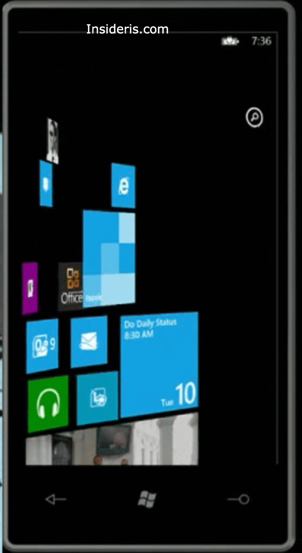
While we wait for any additional WP8 details, here are some minor UI tweaks that we have noticed during yesterday’s WPC 2012 event.
First one:
When you scroll to see a list of apps, the arrow icon is no longer here:

Second one:
As you might remember from the Windows Phone 7.5 “recent” people card, it used to looks like this, a grid of 4 x 2:

However, Windows Phone 8 will get rid of the 4 x grid and introduce 2x grid instead:

Good, bad?
Stay tuned for more.
