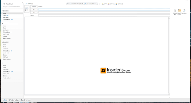
We’ve been playing with the Outlook 15 for quite some time now and while it does offer some improvements when compared to its predecessor, there are still missing features and/or functionality that we’d like to discuss.
1. Missing Send & Receive Button
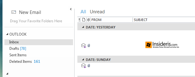
As seen in the picture above, this is how the Outlook 15 UI looks when using in a full screen mode.
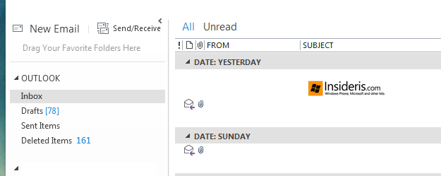
Pretty cool, right? However, for people who manually send and receive emails (especially for the non-important email boxes), there is one thing missing: a conveniently placed “Send/Receive” button. So how do you fix that? It’s simple, offer an ability to include one more button near the “New Email” icon.
2. No Inline “New Email”
Outlook 2013 introduced a much needed and widely requested, “inline reply” feature. Unfortunately, once you start typing a new email, the same old pop up will appear. So while it does make sense to open it in a new window on the PCs with small screens, there is no excuse for such feature not to be enabled when using the 24” or bigger displays.
3. No Minimize & Close Buttons
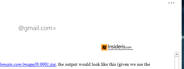
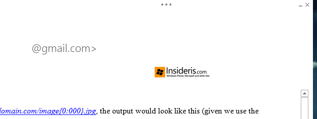
One of the most awesome Outlook 15 features is a Full Screen mode. It eliminates all the clutter and just looks fantastic. However, there is one issue: it lacks minimize and close buttons so every time you start Outlook in the full screen mode, there is no easy way for you to minimize or even close it when required. Including small, Zune like icons would solve this issue.
4. No Contact Edit
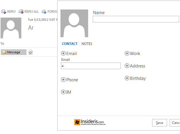
When using Windows Phone, you can easily associate your Facebook friends with various contacts. Unfortunately, in case your friend has a “fake” or non-full name profile, there is no convenient way for you to click on his card in Outlook and link it with the mentioned contact.
5. Dull Email Count
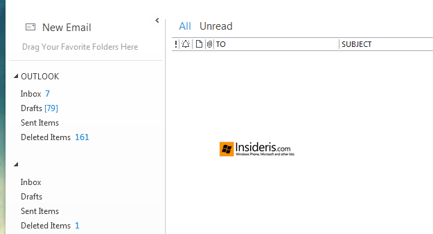
This is not much of a missing feature but rather the user interface tweak. As of now, for people who have what I call “tired eyes”, it’s hard to see how many new emails (if any) you have received. A simple UI tweak would solve this issue. All you have to do is separate email count from the folder name.
6. Broken Search

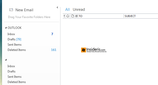
Outlook 15 introduced a new wait to search inboxes and while it does a great job in some ways, there is one fundamental flaw: it won’t search in the “Deleted Items” mailbox.
Even worse, if you are looking for the email (which you likely deleted), not only it won’t search in the “Deleted Items” mailbox but also include data from the “Sent Items” folder.
Honestly, we think that it should either search in all but “Junk” email inboxes or replace “Sent Items” with “Deleted Items” and not vice versa.
7. No Email Compact View

In case you prefer clean and minimal UI, you will be slightly disappointed with the default email view and as far as we can tell, there is no longer a way to change that.
Instead of displaying the email subject only, which creates a friendly and easy to distinguish environment, it will now waste your screen real estate with excerpts from the messages.
Do you have to see those spam messages? I mean, really? Mess vs. clean. Which one do you prefer? We prefer the clean version for all our emails.
Update: Can be done via “View” panel.
8. Can’t Disable The Start Screen

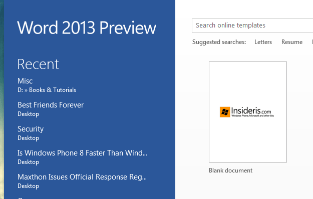
When launching Excel, Word or PowerPoint, users are greeted with the welcome screen, which can be helpful in times. However, when you start a text editor most of the time, all you want to do is begin typing. Unfortunately, Office 15 will slow you down in this case as there is no option for you to skip the “Welcome” screen and pick the default choice.
Update: Can be disabled via Options.
9. Double Spacing Remains
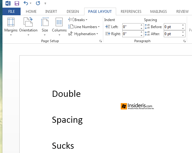
Do we need to say anything else? Why would you even want to waste twice the space?
10. No OneNote 2013 Pre-Load
If you want to compete with other To Do lists, here is a simple tip: open it in time.
Just like when using Outlook, if you double click on the system tray icon, it will immediately open your email client.
So wat happens when you click on the same icon for OneNote 15? It will load the software, again and again, every single time you “close it”.
Opening it instantly, yet offering an ability to minimize would be great.
Conclusion
If you find any of those features interesting, simply click the sad face icon in your Office 2013 suite and submit the feedback accordingly.

